UI++ solicits user input from the interactive user using dialogs. Each dialog type has a unique interactive action that describes what and how to collect information from the user. Each interactive action dialog type has its own set of customizable features and options.
Interactive Action Characteristics
Standard Characteristics
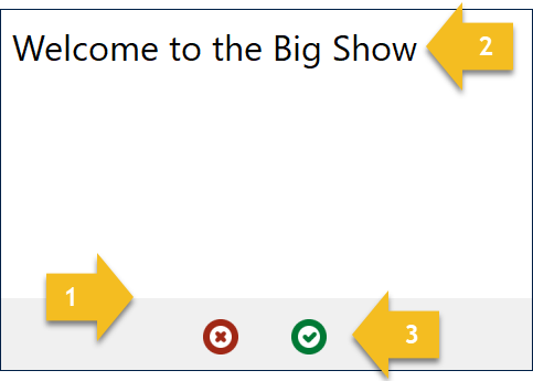
All user interface dialogs created by interactive actions have the same look and feel, including the following common characteristics.
- Flat look and feel
- Major title
- Action buttons
You can individually customize the title of each dialog. The type of interactive action and the valid activites for that interactive action determine which buttons that dialog shows. These may include some or all of the following button types:
- OK
- Cancel
- Go Back
- Retry
Optional Characteristics
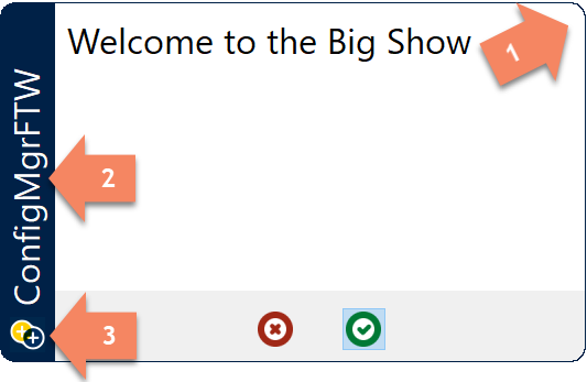
The following are optional look and feel characteristics for dialogs created by interactive actions.
- Rounded corners
- Sidebar with title
- Sidebar icon
You can customize the sidebar color, title, and icon. Note that all dialogs within a single UI++ configuration share whatever values you specify for these. You do not have to supply a sidebar icon in which case the sidebar title aligns with the bottom of the sidebar.
Interactive Actions Introduction
Interactive actions show a dialog to the interactive user and enable direct user input or provide feedback to the user. Each interactive action has multiple configurable appearance and behavior options.
UI++ is not limited to a single interactive action but instead can present multiple interactive actions and thus dialogs. Multiple interactive actions are useful to group specific types of user requests together, to prompt for different items of information, or display information to the user. The exact order, behavior, and appearance are up to you based on your requirements.
Info
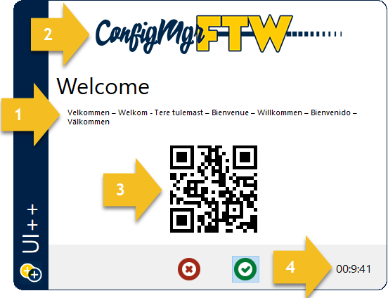
The Info interactve action shows a simple informational dialog. This dialog conveys information to the user. It includes an open text area which is formatted using a subset of standard HTML tags.
Info actions have the following characteristics:
- Information text.
- Optional header image.
- Optional informational image.
- Optional countdown timer.
Error Info
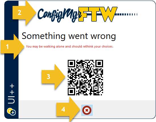
The ErrorInfo interactive action is nearly identical to an Info action except that it only shows a Cancel button.
ErrorInfo actions have the following characteristics:
- Information text.
- Optional header image.
- Optional informational image.
- Cancel button (and only a cancel button).
Input
User input in UI++ is mainly solicted using Input interactive actions. Input action dialogs display a dialog containing multiple text boxes, drop-down list boxes, checkboxes, or simple informational items. Collectively, these are referred to as input elements. If you configure more input elements than will fit on a single dialog, only the first elements will be shown based on the size of the dialog and the type of input elements.
The OK button on an Input action dialog is disabled until all input elements match their defined regular expressions and all drop-down list boxes that require a selection have a valid selection.
Text Input
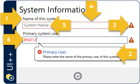
Users enter text into InputText elements. InputText elements have the following characteristics:
- A prompt/question.
- Tooltip with a message describing the correct format of the text.
- Exclamation icon indicating that the field is not in the correct format or input is required.
- InputText elements are outlined in red when they do not have focus and do not contain text matching the correct format.
- InputText elements with no text display a prompt to help the user know what to enter.
- Text within an InputText element that does not match the correct format is colored red.
- Optional regular expression defining the exact format of acceptable text (not shown).
Choice Input
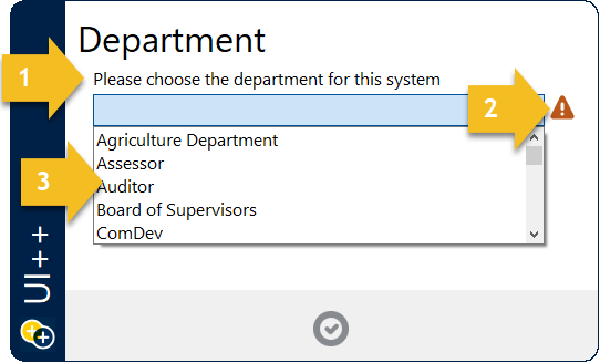
An InputChoice element is presented as a drop-down list box. Each InputChoice element has the following characteristics:
- A prompt/question
- An exclamation icon indicating that a choice has been made when one is required.
- A drop-down list of customizable choices.
- Optional auto-completion.
- Optional visible list size.
- Optional automatic sorting of list items.
Checkbox Input
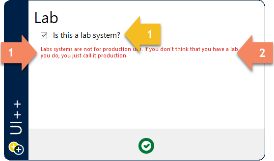
Ineractive users make a binary choice using InputCheckbox elements which are presented as standard checkboxes.
Each InputCheckbox element has the following characteristics:
- A prompt/question
Info Input
InputInfo elements present static text to the interactive user. They are classified as input elements because they appear on Input action dialogs.
Each InputInfo element has the following characteristics.
- Text color.
- Single or double line of text.
Preflight
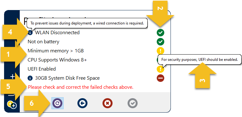
The Preflight interactive action performs a series of checks, generally as a precursor to additional activity. Check evaluation may result in success, warning, or failure based on thresholds and criteria configured for each check. Check evaluation results are displayed to the interactive user so that they can address any issues. Failed checks block UI++ from proceeding to the next configured action.
Preflight actions have the following characteristics:
- A list of evaluated checks.
- Result indicators for each evaluated check.
- Tooltips for warning and error indicators.
- Additional information indicators with tooltips to display the additional information.
- Overall preflight evaluation result text.
- Optional retry button to re-evaluated all checks and display updated results.
- Optional countdown timer (not shown).
Application Tree
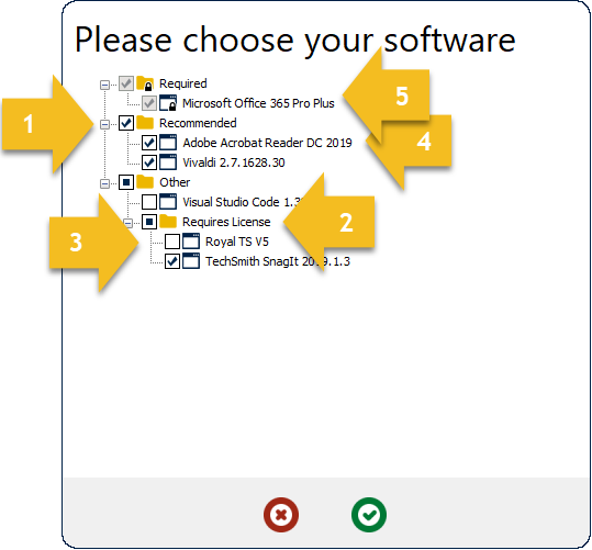
The AppTree interactive action displays a dialog with a selection tree containing pre-defined software items. These software items may include applications and packages as well as pre-defined groupings of software items. The interactive user chooses which of the software items they wish to install. Note that this action is only beneficial when used in combination with a ConfigMgr-based task sequence.
AppTree actions have the following characteristics:
- Groups.
- Subgroups.
- Software items (applications or packages).
- Default software items and groups.
- Required software items and groups.
- Hidden software items (not shown).
User Authentication
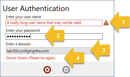
The UserAuth interactive action displays a fixed set of three fields to the user. The user must supply their Active Directory domain credentials to authenticate and proceed with the rest of the actions defined for UI++.
UserAuth actions have the following characteristics:
- Customizable regular expression based validation of all fields.
- Masked password entry.
- Drop-down selection or free-text entry of domain to authenticate against.
- Authentication attempt message.
- Customizable prompt text for each field (not shown).
- Maximum number of retries (not shown).
- User immediate group membership retrieval (not shown).
- User authorization based on immediate group membership (not shown).
Info (Full-Screen)
Preview 3.0.1.0
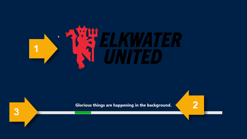
The InfoFullScreen interactive action displays a full-screen, always on top window with a single line of text and a banner image.
InfoFullScreen actions have the following characteristics:
- Customizable banner image.
- Customizable message text.
- Infinite progress bar.