The Input action creates a dialog for direct, interactive user input. It displays any combination of the following input types:
Input action dialogs may contain as many input items that you need; however, the dialog only displays the first three, six, or nine based on the configured sizes which can be Regular, Tall, or ExtraTall.
The following snippet creates an Input action dialog with the specified information in the title.
<Action Type="Input" Name="myInput" Title="Please answer the following" Size="Tall">
...
</Action>
InputText
An InputText item enables the user to enter text in response to a prompt or question; UI++ can validate this text using a standard regular expression. UI++ stores the value that the user enters in the specified variable.
An InputText has multiple visual cues to guide and inform the user, including the following:
- Prompt
- Hint
- Border color
- Alert icon
The following table lists the cues, their effects, and the conditions under which the Input action shows them for an InputText.
| Cue | Effect | Control has focus | Condition |
|---|---|---|---|
| Prompt | Grey prompt text shown in the InputText | No | User has not entered any text |
| Hint | Tooltip | Yes | User entered text that does not match the configured regular expression |
| Input text color | Red text | Both | User entered text that does not match the configured regular expression |
| Border color | Red border | Yes | User entered text that does not match the configured regular expression or entered no text when a response is required |
| Icon | Alert icon | Both | User entered text that does not match the configured regular expression or entered no text when a response is required |
If the variable specified for an InputText already exists and contains a value, then UI++ uses this value as the default value for the InputText; this overrides any values specified using the Default attribute.
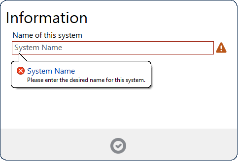
The following example prompts the user to enter a desired name for the system and validates that the entered text is at least three characters long but no more than 15 characters. It then stores the value entered in a variable named SystemName.
<Action Type="Input" Name="SystemNameInput" Title="Information" ShowBack="True">
  <InputText Prompt="System Name" Hint="Please enter the desired name for this system." RegEx=".{3,15}" Variable="SystemName" Question="Name of this system" />
</Action>
You can configure UI++ to validate the value entered in an InputText item against Active Directory. This enables UI++ to check if a computer or user name already exists in Active Directory and prevent progress if desired. See Active Directory Checks for further details.
InputChoice
This input type displays a drop-down list box (also known as a combo-box) to the user from which they can choose a value in response to a question or prompt. Free text-entry is not allowed. You can specify a default value, but one is not required. Based on the user choice, the Input action places the selected option or an alternate value in the specified variable. Optionally, the task can also place an additional, second alternate value in an alternate variable.
Use Choice sub-elements to define the options presented in the drop-down list. Each Choice element defines the text shown in the list as well as a value and an alternate value to populate the main and alternate variables with if the user selects it from the list. Specifying a value or an alternate value is optional; if you do not specify a value, the Input action uses the value of the Option attribute to populate the main variable specified. If you do not specify an alternate value, then the Input action does not populate the alternate variable with any value.
You configure the initial value using the Default attribute; if you do not specify a default, the initial value is blank. If you set the Required attribute to True but do not set a Default value, then the user must select one of the choices from the list box before being able to dismiss the Input dialog and move on. If you do not set a Default value and set the Required attribute to False, then the Input dialog displays a red exclamation icon after the InputChoice.
For list boxes with many possible choices, you can enable auto-completion using the AutoComplete attribute. Setting this to True enables the user to type into the edit box of the list box. Text entered is automatically completed using the available choices in the list box. If the user enters text that does not match any available choices, then no choice is selected, and the user cannot continue until they select or enter a valid choice.
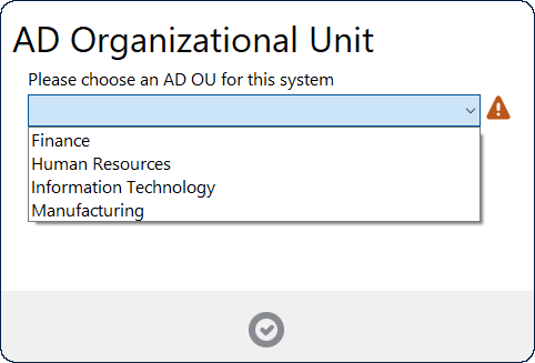
The following example prompts the user to select an OU for the system and, based upon this selection, populate the OUChoice and SystemPrefix variables.
<Action Type="Input" Name="OUChoice" Title="AD Organizational Unit">
  <InputChoice Variable="OUChoice" AlternateVariable="SystemPrefix" Sort="False" Question="Please choose an AD OU for this system" Required="False" AutoComplete="False">
    <Choice Option="Finance" Value="OU=Finance,OU=Workstations,DC=lab300,DC=configmgrftw,DC=com" AlternateValue="FIN" />
    <Choice Option="Human Resources" Value="OU=HumanResource,OU=Workstations,DC=lab300,DC=configmgrftw,DC=com" AlternateValue="HR" />
    <Choice Option="Information Technology" Value="OU=IT,OU=Workstations,DC=lab300,DC=configmgrftw,DC=com" AlternateValue="IT" />
    <Choice Option="Manufacturing" Value="OU=IT,OU=Workstations,DC=lab300,DC=configmgrftw,DC=com" AlternateValue="MAN" />
  </InputChoice>
</Action>
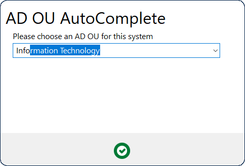
Instead of using multiple Choice sub-elements to specify each item in the list, you can use a single (or multiple) ChoiceList sub-elements. The ChoiceList element specifies comma-separated lists of items to add to the drop-down list as well as corresponding comma-separated lists of values and alternate values. Using a ChoiceList is useful to populate the list from an existing variable containing the list, which you can in turn populate from a variety of sources, including an external file.
The following example shows loading the options and alternate values from two separate ChoiceList elements stored in previously defined variables. The resulting Input dialog is identical to the above example, but the configuration is more concise and potentially more flexible.
<Action Type="TSVar" Variable="olist">"Finance,Human Resources,Information Technology,Manufacturing"</Action>
<Action Type="TSVar" Variable="alist">FIN,HR,IT,MAN</Action>
<Action Type="Input" Name="OUChoice" Title="AD OU AutoComplete" AutoComplete="True">
  <InputChoice Variable="OUChoice" AlternateVariable="SystemPrefix" Sort="False" Question="Please choose an AD OU for this system" Required="True" AutoComplete="True">
    <ChoiceList OptionList="%olist%" AlternateValueList="%alist%" />
  </InputChoice>
</Action>
InputCheckbox
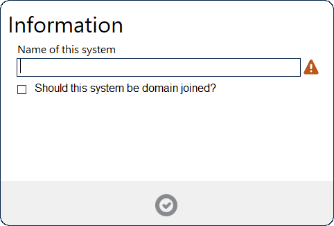
The next input type for the Input action is an InputCheckbox. It populates a specified variable with one of two values based upon whether the user checks the checkbox or not.
This example builds on the one from the InputText section above and adds a checkbox. The action populates the variable DomainJoin with a value of Yes if the user checks the checkbox or No if the user leaves the checkbox unchecked.
<Action Type="Input" Name="SystemNameInput" Title="Information" ShowBack="True">
  <InputText Prompt="System Name" Hint="Please enter the desired name for this system." RegEx=".{3,15}" Variable="SystemName" Question="Name of this system" />
  <InputCheckbox Variable="DomainJoin" Question="Should this system be domain joined?" CheckedValue="Yes" UncheckedValue="No"/>
</Action>
InputInfo
This final input type for the Input action dialog doesn’t actually allow any user input but does allow the Input action dialog to display additional informational text. You can configure the text to display and the color of that text. You can configure UI++ to display the text on one or two lines using the NumberOfLines attribute. UI++ will automatically resize the text if it is too long to fit on the dialog.
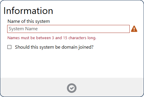
This example also builds on the previous examples by adding a line of red text below the InputText item.
<Action Type="Input" Name="SystemNameInput" Title="Information" ShowBack="True">
  <InputText Prompt="System Name" Hint="Please enter the desired name for this system." RegEx=".{3,15}" Variable="SystemName" Question="Name of this system" />
  <InputInfo Color="#992233">Names must be between 3 and 15 characters long.</InputInfo>
  <InputCheckbox Variable="DomainJoin" Question="Should this system be domain joined?" CheckedValue="Yes" UncheckedValue="No"/>
</Action>